BRAND IDENTITY
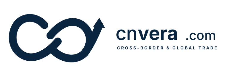
A brand built for cross-border trade: a Möbius double loop with a rising breakthrough arrow. Two-way circulation between China and the world, infinite empowerment, continuous growth.
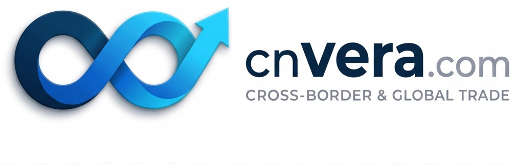
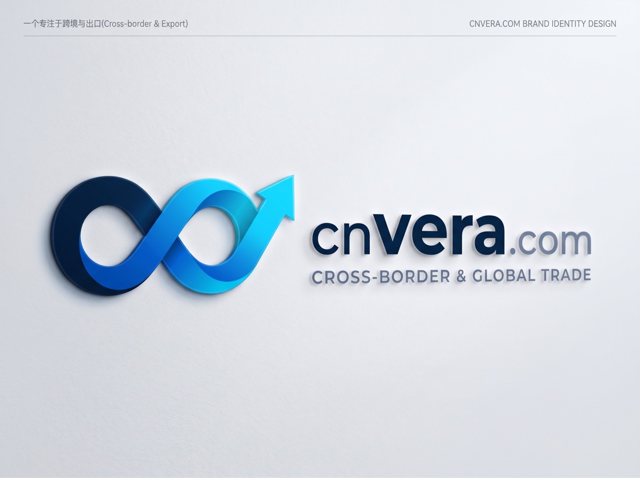
Brand identity design board — 方案一:Möbius double loop + rising arrow.
Two interlocking loops form one continuous Möbius flow: goods, technology and trust circulating between China and the world in both directions, without end.
Drawn in deep-sea navy, the left loop stands for origin and depth: China's supply chains, settled and reliable, the ground the brand stands on.
The right loop flows onward in sky blue toward global markets, and breaks out at the top right into a rising arrow: exports, breakthroughs, continuous growth.
CN is China. vera comes from the Latin for true, genuine — real goods from real growers, and a name buyers can trust. The wordmark is set in Montserrat: cn in Medium, vera in Bold — rooted in China, genuine at the core — with .com smaller, in neutral gray. The strapline says what we do: CROSS-BORDER & GLOBAL TRADE.
Primary — trust. Steadiness, compliance and strength across oceans. The left loop, the wordmark, formal documents.
Secondary — digital & speed. The momentum of goods moving worldwide. The right loop, the arrow, highlights and buttons.
Supporting — clean. The .com suffix, subtitles, body text and dividing lines.
The standard horizontal lockup — mark on the left, wordmark on the right — as used at the top of this site.
The core double-loop arrow on its own, legible down to 32×32 px as a browser favicon or app icon.
A single-color version for shipping marks, export cartons and customs stickers — compact and recognizable in silk-screen or thermal print.
Downloads: Logo (SVG) · Icon (SVG) · Monochrome (SVG) · Design board (JPG)